


Official Supplier
As official and authorized distributors, we supply you with legitimate licenses directly from 200+ software publishers.
See all our Brands.
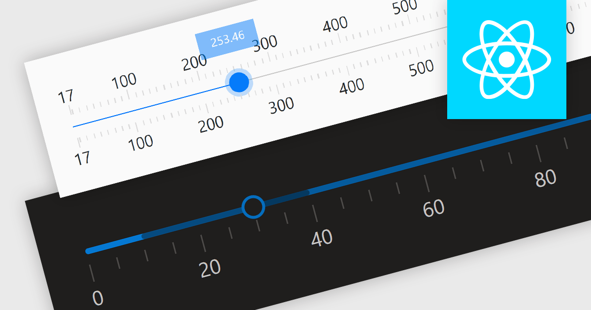
Trackbar controls, also known as sliders, are user interface (UI) elements that allow users to adjust a numerical value within a defined range by moving a slider along a bar. These controls are highly valuable for settings that require a visual representation of adjustment, such as volume, brightness, or other application-specific parameters. Trackbars enhance the user experience by providing a simple and effective method to input values, which can be particularly useful for fine-tuning settings without the need for direct numerical input. Their intuitive design promotes ease of use and quick interaction, making them an excellent choice for graphical user interfaces where space is limited and precision is necessary.
Several React components offer Trackbar Data Editors including:
For an in-depth analysis of features and price, visit our comparison of React Data Editors.
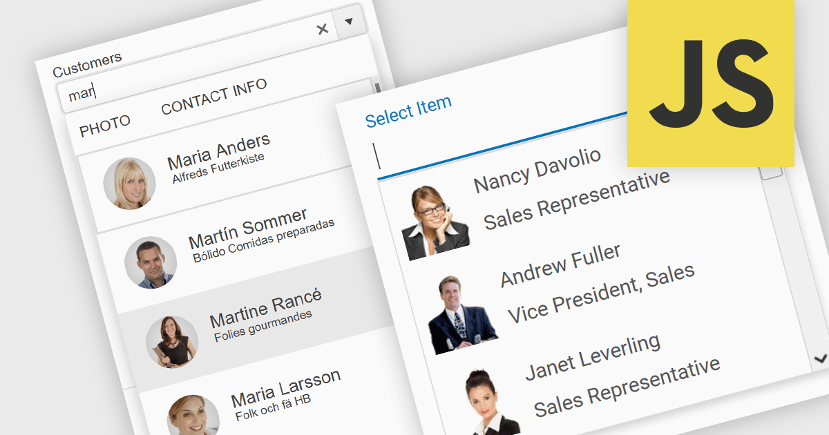
An image combobox is a custom UI component that combines a traditional dropdown menu with the ability to display an image alongside each item. Image comboboxes can enhance user experience by providing a more intuitive way to identify and select options, especially for items that benefit from visual representation. This approach can be particularly useful for non-text-based data or for catering to users who prefer visual cues.
Several JavaScript Data Editor controls support image combobox functionality including:
For an in-depth analysis of features and price, visit our comparison of JavaScript Data Editors.
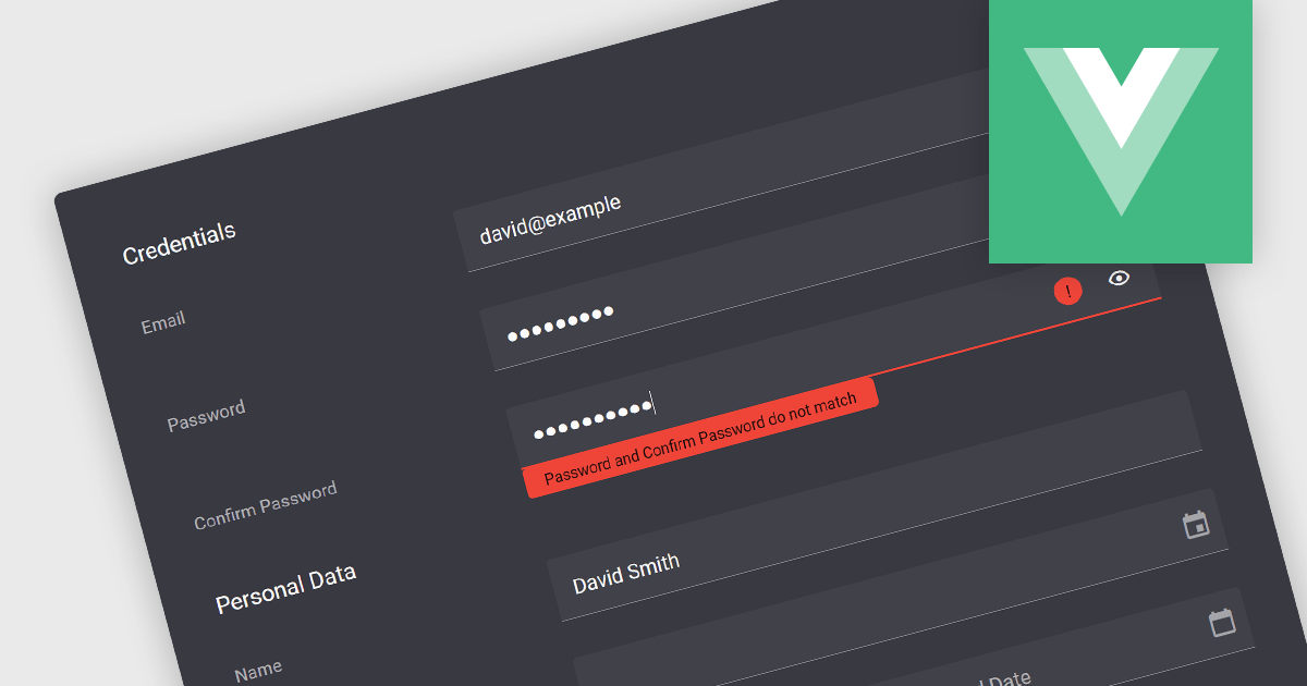
Validation in data editor controls refers to the process of ensuring user-entered information conforms to predefined rules. This helps prevent invalid or erroneous data from being stored in your application. By implementing data validation, you improve data integrity, reduce the need for manual data cleansing, and ultimately streamline the development process by catching errors early on.
Here are some examples of Vue.js data editors that support data validation:
For an in-depth analysis of features and price, visit our comparison of Vue.js Data Editors.
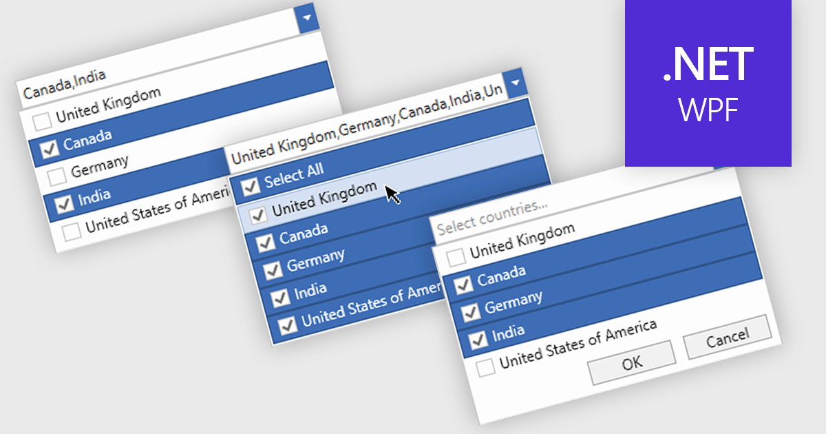
Checked combobox controls are data editor user interface elements that allow users to select multiple options from a dropdown list while visually indicating their choices through checkboxes. These controls provide developers with a convenient way to implement multi-select functionality within their applications, enhancing the user experience by offering intuitive selection methods. By integrating checked combobox controls, developers can streamline data entry processes, improve usability, and increase productivity within their software applications, ultimately leading to more efficient and user-friendly interfaces.
Many .NET WPF Data Editor collections contain checked combobox components including:
For an in-depth analysis of features and price, visit our comparison of .NET WPF Data Editors.
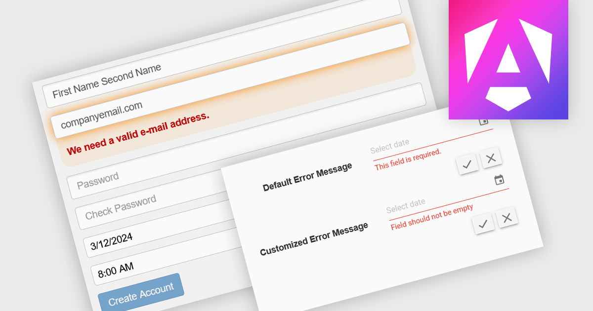
Data validation is a process built into data editors that ensures the accuracy and integrity of information being entered. It achieves this by applying various checks on the data, ranging from data type verification to ensuring values fall within a specific range or adhere to predefined formats. By implementing data validation, software developers can significantly reduce the risk of errors during data entry, leading to cleaner, more reliable datasets for downstream analysis and reporting.
Several Angular Data Editor controls offer data validation including:
For an in-depth analysis of features and price, visit our Blazor data editors comparison.


Tel: (888) 850 9911
Fax: +1 770 250 6199


